
UX patterns and guildelines
New products often lack consistency, and in a fast-growing company there are rarely enough designers to provide sufficient UX support for all teams. To counteract this gap it is helpful to develop and document guidelines which can be shared within the company and with other teams.
For the UX team, as well as for my frequently changing project teams, I developed multiple UX guideline documents, which contained UX best practices to build intuitive, user-friendly and consistent products.
1. UX pattern library for interactive components

UX pattern library document: Look and feel specification of a dropdown and a process explorer component.
What was the need?
Although there was already a detailed styleguide for the UI components of the Celonis tools, what was missing was a single source of truth explaining and visualising the interaction behaviour and status changes of the (data-)components of the specific dashboard tools.
What did I do?
Creation, ownership and maintenance of the UI library in Figma, collecting the required content and regularly sharing the new specifications with the internal (Data-) Front-End Engineers.
👤 Users: Internal UX Designers and internal Front End Developers
Tools used: Figma
Delivered solution:
📖 Figma file containing following UX pattern:
-
UI- and interaction specifications of all interactive components (buttons, forms, charts, filters, etc.)
-
Possible states of the components on the dashboard, especially to differentiate between editing and viewing mode and after applying filters.
2. UX guidelines for dashboard apps
What was the need?
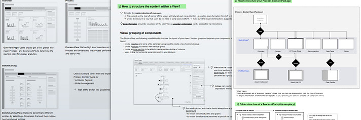
The Celonis dashboard tool enables users to create their own dashboards and display data connected to their system. It is also possible to create Celonis apps, which are essentially combinations of multiple single dashboards. Since there are countless ways to design apps and single dashboards, the internal team of app creators requested guidance on how to build a Process Exploration app which has a consistent user experience with Celonis's other prebuilt apps, is user-friendly, accessible, and complies with the Celonis style guide.
What did I do?
At the beginning I analysed the most popular process exploration apps that Celonis sells, and talked to the solution engineers about what works well for the customers and what does not. I then designed an app based on the structure of a successful app, customer feedback and the design of our style guide, working with a team that built a new app from scratch. From this, I derived general patterns, guidelines and best practices for process exploration apps that could be applied to all custom processes by other app teams.
👤Users: Internal and external data scientists and solution engineers, who use the Celonis tools to build dashboards and data apps.
Delivered solution:
UX guidelines document to be shared, containing:
-
High-level information architecture of a standard process cockpit app
-
How to navigate and interact between multiple dashboards
-
How to structure the Process Cockpit content on the dashboard
-
How to set up the layout and which components and visualisations to use in which case
-
Best practice example
3. 📊Data visualisation - design library

What was the need?
Data visualisations are used to present a large set of data in a way, that the underlying information is easy to understand for the users. Especially outliers in the data and values outside of a certain threshold need to be immediately visible and easy to be classified as good or bad.
What did I do?
In close collaboration with the team of data visualisation developers I built up a Data Visualisation library in Figma, which contained global UI- and interaction patterns, rules for color usage and guidance on which chart or diagram to use to best present certain information. And specifications for the single data components.
👤Stakeholders & users: Internal UX designers and developers
Delivered outcome:
Regularly updated Figma design document, which contained:
-
UI specifications for all data components (charts, diagrams, tables)
-
Interaction behaviour (default states, filters, possible interactions)
-
Error states for each data component
-
When to use which colors and color schemes for making data informative

From august 2019 until july 2022 I worked at Celonis as a UX Architect and UX Designer .
Celonis is a highly dynamic and fast-growing international data processing company founded 2011 in Munich. The main product is Software as a Service (SaaS) to improve business processes.
I was responsible for
-
Improving user flows, usability, accessibility of various existing features within the software as well as
-
Conducting user research
-
Designing new features and products
-
Onboarding new UX colleagues
I supported internal teams to develop user-centered, intuitive Celonis "Execution Apps" that are conformant with our styleguide as well as follow our best practice interaction patterns. These apps can be set up, build and customised with Celonis' own "Studio"-editor, which was one of the products I supported, too.